

Scroll to Top

Aligning four agencies under One UX Strategy for ExxonMobil’s newest business unit
ExxonMobil launched Low Carbon Solutions (LCS) to commercialize decarbonization inside a legacy oil brand — a 0→1 experience split across four agencies with no shared direction. As UX lead, I owned the experience strategy and the governed design system that let teams ship, and grew the metrics a business cares about: conversion, engagement, adoption, and speed.
+41%
conversion on priority journeys
+28%
user engagement, -34% bounce
2x
faster design-to-launch
94%
design-system adoption, 4 agencies
My contributions
01 - Strategy
Defined a UX strategy where none existed
Framed an undefined 0→1 problem into a point of view and 5 core user journeys.
02 - Systems
Design systems & governance
Rebuilt and governed a scalable system with components, patterns, and accessibility baked in.
03 - Vision
Aligned leadership around one UX vision
Won lead-agency status and expanded scope by telling a story leadership could act on.
04 - Impact
Business Impact
Tied design to outcomes leaders recognize — conversion, engagement, adoption, and delivery speed.
The Situation
ExxonMobil’s Low Carbon Solutions (LCS) division was formed to commercialize decarbonization technologies under the umbrella of a legacy oil brand. The business unit was new, ambitious, and under intense scrutiny internally and externally.
When I joined the project in early 2024, I was originally tasked with optimizing user journeys between the parent site and the LCS business unit site. While learning what I could about the brand, the users, and the agencies working on it, it became clear that the absence of a unifying strategy was leading to duplication, misaligned priorities, and frustrated clients forced to mediate cross-agency communication.
It became clear that the technical challenges weren't the primary obstacle. The bigger problem was organizational: four agencies moving in different directions without a shared vision.


Role
UX Lead

Timeline
2024 Q1 - 2025 Q4

Stakeholders
ExxonMobil LCS C-suite
Marketing, Brand, and Product
Agency Collaborators
4 external agencies separately owning content, development, UX, & strategy
Process


First, I audited the experience and put the truth on the table

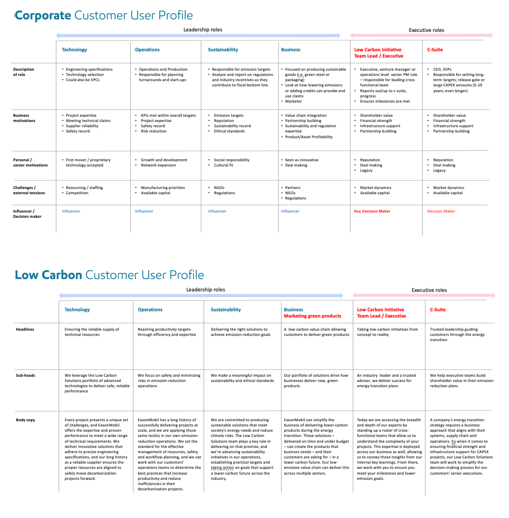
Differentiating corporate and low carbon customers
I did a focused UX audit of user journeys between the parent site and the LCS site, documented the inconsistencies, and showed precisely how the overlapping language and missing links were undermining the ability of the LCS brand to target its niche users and differentiate its value.
I built a crystal-clear deck to put the reality of the current situation on the table:
- What was happening
- Why it was happening
- How it confused users
- and How we could immediately improve
That deck got attention fast and earned me a seat at the larger cross-agency table.
Why this approach
I wasn’t going to convince anyone by solely pointing at the problem. Problem statements don’t matter to anyone if they aren’t paired with solutions.
Then I worked with strategists and writers to define a real point-of-view
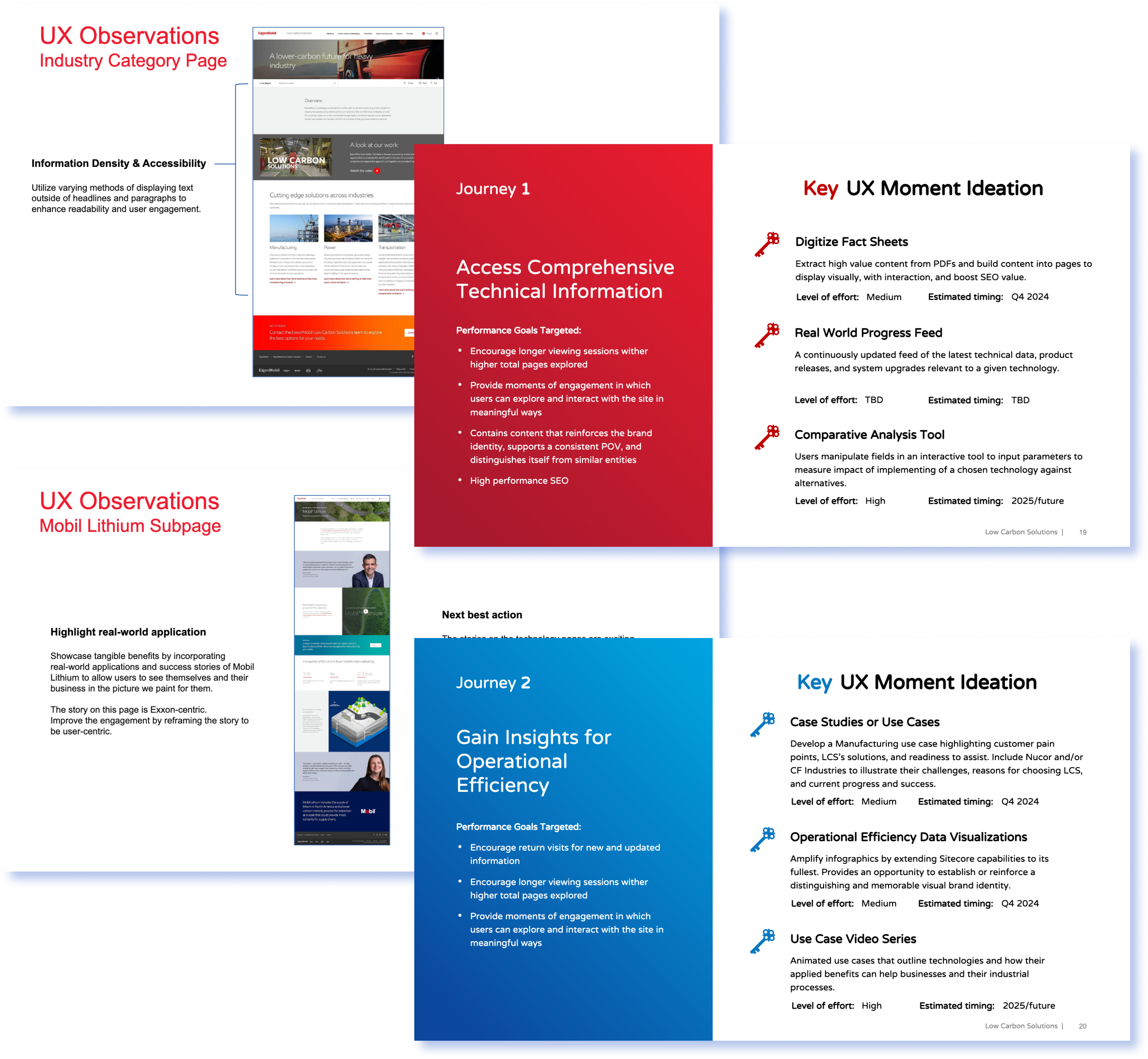
Slides from the deck I created that highlighted opportunities for improvement in the current state. This helped the team come together and agree on direction for the site, which I articulated into 5 core UX journeys.
A person’s ability to clearly understand who you are and what you offer is directly a result of both:
- Having a core truth that is exceedingly simple and
- The ability to elaborate upon that truth articulately.
This intersection between content, strategy, and UX requires parity in perspectives to create good output. To work for a solution, I collaborated extensively in newly built relationships across agencies so that we utilize our available combined resources and confidently find an answer to the question: “what is the brand’s point-of-view?”
It’s not an easy question to answer and its one that has a different answer for every person you ask.
While I could have immediately started plotting research methods and interview questions, I started by reviewing insights-rich materials from customer research data, focus group results, engagement analytics, and usability testing. All of it varied in recency and fidelity and there was no governance over the collection, which so often becomes the death of great ideas.
The analysis of the prior work informed ensuing audits and working sessions designed to fill in the gaps.
I translated what I heard into 5 core UX journeys that plainly showed users’ needs for the web site and how those intersected with the business’s needs.
I pitched to clients and when I walked them through the work, it *clicked.* Each time we discussed an idea and agreed it isn’t right for the brand, it communicated something to the entire team about what the brand is not.
The outcome of this was a point-of-view that felt clean, smart, and distinct. That became the engine that powered ideas, and everyone rallied around those ideas because they had a stake in them.
We earned client trust from this. They named us the lead agency of the inter-agency team and we took on more responsibility and a larger scope of work.
Why this approach
The vision gave everyone a directive that didn’t threaten their autonomy and began to dispel the uncertainty getting in the way of creative work.
I built systems that made design and content work more efficiently
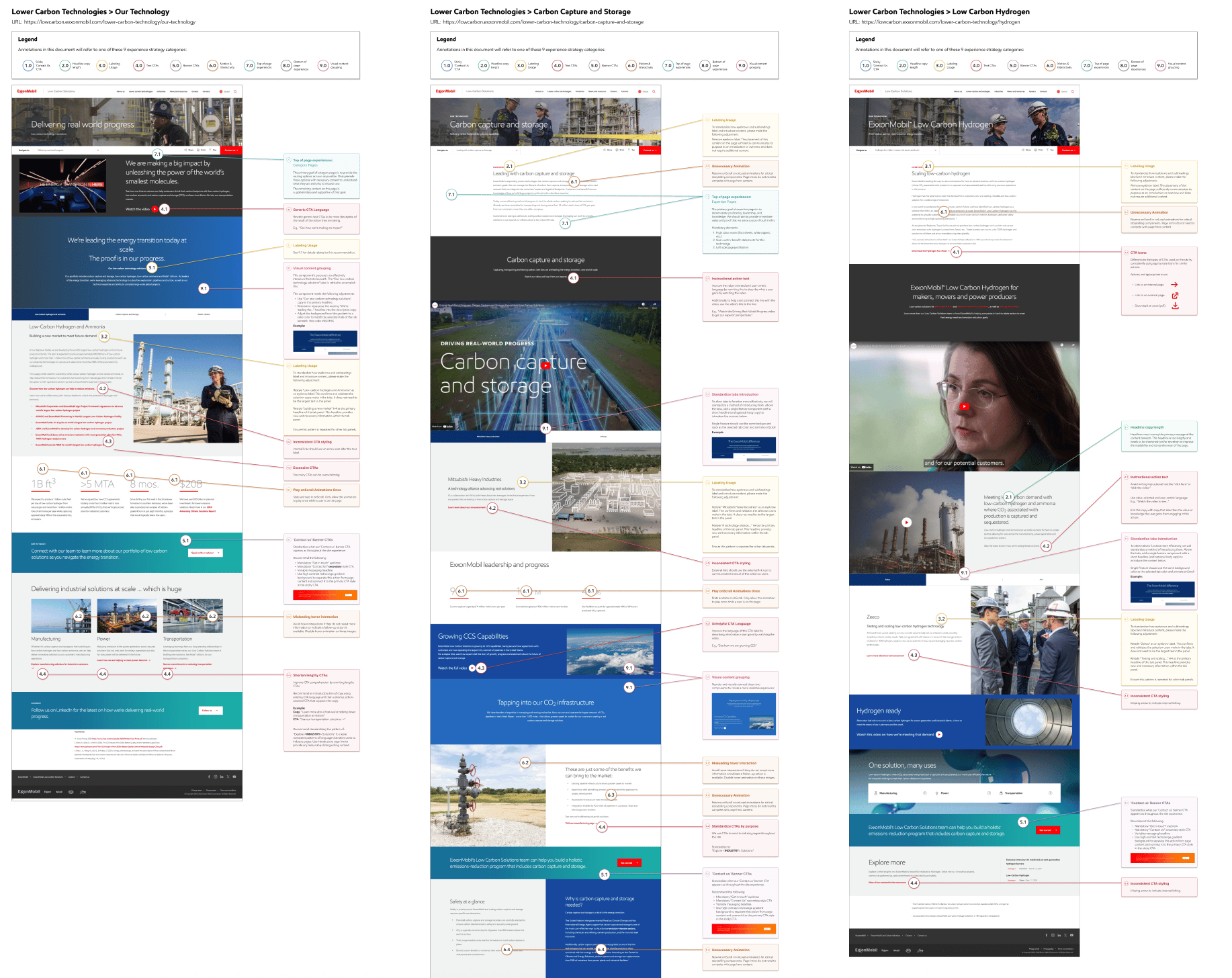

Auditing the experience and identifying 9 UX strategy guidelines to govern the digital experience.
With the point-of-view defined, the next bottleneck was structure. The site was full of patterns that contradicted each other.
I did an exhaustive UX audit to identify inconsistencies and UX improvements. I iterated on what I had produced to categorize my 154 recommendations between 9 UX Strategy Guidelines.
These guidelines included governance recommendations for:
- Headline copy length
- Text CTAs: Primary, secondary, and inline
- Motion and interactivity
- and more
Then I collaborated with the visual designers and dev team to refine and validate everything.
Everything lived in Figma, which made it an easy reference for everyone across the network of agencies.
The tricky part was that the agency responsible for implementation owned the official design system, which didn’t live in a working design file.
To create a page, our inter-agency team relied on excessive communication and an incomplete documentation website. Nuance was lost and there were so many fringe cases we could have started our own rodeo.
So I rolled up my sleeves and tediously reverse-engineered the entire design system frame-by-frame. It wasn’t pixel perfect and it took time to replicate updates but it was evident that we needed this to do our work well.
This became the system my team actually used. Designers were able to produce more creative work that refined and separated the visual identity of the LCS brand because seeing the boundaries clearly showed them how much more they could push.
Writers appreciated it too because they could actually visualize the result of their writing in layout before it was handed off to be implemented, encouraging refinement.
The entire workflow sped up noticeably and that unified vision remained a beating drum that kept us all moving towards the same targets.
Why this approach
Systems thinking was the lever for both creativity and speed. Once structure existed, the team’s creativity soared.
I operationalized the vision and led day-to-day execution

Day to day operations consisted of delivering wireframes, layouts, and UX strategies aligned to the web playbook principles I defined at the onset of the work.
Once the systems and direction were in place, the work shifted into a steady rhythm. We were consistently asked to create new pages or refine existing ones, and I led the UX for a complete redesign of the business unit’s web site.
This phase was all about making the system real. I partnered with writers to shape content, worked with designers using the Figma system I built, and checked every page against the priorities we had defined for LCS.
My focus was keeping the work consistent and intentional. Each page reinforced the LCS identity instead of drifting away from it. And because the structure was solid, the team moved quickly and leadership trusted the output.

Outcomes
What success looked like
Conversion, priority journeys
2.4%

3.6%
Engaged sessions per user (indexed)
100
128
Bounce rate, key pages
54%
36%
Design-system adoption across agencies

94%

The redesign became a growth channel — conversion up across every priority journey.
Experience quality rose — engagement up, bounce down, usability benchmarked higher.
A governed design system scaled across four agencies without losing cohesion.
LCS differentiated itself from its parent — a brand with its own voice.
My agency earned the lead role and expanded scope; design maturity rose team-wide.
Help!
You see a lot more portfolios than I do. Help me out by making a selection below:
Be honest...what do you think of this case study?

It’s great!

Needs work
Hard to say

Retrospective
If I could do it all again, I’d dive into the tools we had available for measuring success and tailor a more achievable measurement plan. It was too easy for the team to dismiss data collection when it was clear what we wanted to collect but it wasn’t clear how we would collect it.
But honestly, the biggest lesson was simpler: solving problems is rarely about a revolutionary idea. Sometimes, you just need someone to walk in, point at the chaos, and tell a roomful of people a story that gets them excited about what come next.
Ready to talk?
Let’s get connected.
Contact Brendan
Want to see more?
See another project
home
Work
practices
Let’s Connect
Aligning four agencies under One UX Strategy for ExxonMobil’s newest business unit
ExxonMobil launched Low Carbon Solutions (LCS) to commercialize decarbonization inside a legacy oil brand — a 0→1 experience split across four agencies with no shared direction. As UX lead, I owned the experience strategy and the governed design system that let teams ship, and grew the metrics a business cares about: conversion, engagement, adoption, and speed.
+41%
conversion on priority journeys
+28%
user engagement, -34% bounce
94%
design-system adoption, 4 agencies
2x
faster design-to-launch
My contributions
01 - Strategy
Defined a UX strategy where none existed
Framed an undefined 0→1 problem into a point of view and 5 core user journeys.
02 - Systems
Design systems & governance
Rebuilt and governed a scalable system with components, patterns, and accessibility baked in.
03 - Vision
Aligned leadership around one UX vision
Won lead-agency status and expanded scope by telling a story leadership could act on.
04 - Impact
Business Impact
Tied design to outcomes leaders recognize — conversion, engagement, adoption, and delivery speed.
The Situation
ExxonMobil’s Low Carbon Solutions (LCS) division was formed to commercialize decarbonization technologies under the umbrella of a legacy oil brand. The business unit was new, ambitious, and under intense scrutiny internally and externally.
When I joined the project in early 2024, I was originally tasked with optimizing user journeys between the parent site and the LCS business unit site. While learning what I could about the brand, the users, and the agencies working on it, it became clear that the absence of a unifying strategy was leading to duplication, misaligned priorities, and frustrated clients forced to mediate cross-agency communication.
It became clear that the technical challenges weren't the primary obstacle. The bigger problem was organizational: four agencies moving in different directions without a shared vision.
Role
UX Lead
Stakeholders
ExxonMobil LCS C-suite
Marketing, Brand, and Product
Agency Collaborators
4 external agencies separately owning content, development, UX, & strategy
Timeline
2024 Q1 - 2025 Q4
Process

Differentiating corporate and low carbon customers
First, I audited the experience and put the truth on the table
I did a focused UX audit of user journeys between the parent site and the LCS site, documented the inconsistencies, and showed precisely how the overlapping language and missing links were undermining the ability of the LCS brand to target its niche users and differentiate its value.
I built a crystal-clear deck to put the reality of the current situation on the table:
- What was happening
- Why it was happening
- How it confused users
- and How we could immediately improve
That deck got attention fast and earned me a seat at the larger cross-agency table.
Why this approach
I wasn’t going to convince anyone by solely pointing at the problem. Problem statements don’t matter to anyone if they aren’t paired with solutions.
Then I worked with strategists and writers to define a real point-of-view
A person’s ability to clearly understand who you are and what you offer is directly a result of both:
- Having a core truth that is exceedingly simple and
- The ability to elaborate upon that truth articulately.
This intersection between content, strategy, and UX requires parity in perspectives to create good output. To work for a solution, I collaborated extensively in newly built relationships across agencies so that we utilize our available combined resources and confidently find an answer to the question: “what is the brand’s point-of-view?”
It’s not an easy question to answer and its one that has a different answer for every person you ask.
While I could have immediately started plotting research methods and interview questions, I started by reviewing insights-rich materials from customer research data, focus group results, engagement analytics, and usability testing. All of it varied in recency and fidelity and there was no governance over the collection, which so often becomes the death of great ideas.
The analysis of the prior work informed ensuing audits and working sessions designed to fill in the gaps.
I translated what I heard into 5 core UX journeys that plainly showed users’ needs for the web site and how those intersected with the business’s needs.
I pitched to clients and when I walked them through the work, it *clicked.* Each time we discussed an idea and agreed it isn’t right for the brand, it communicated something to the entire team about what the brand is not.
The outcome of this was a point-of-view that felt clean, smart, and distinct. That became the engine that powered ideas, and everyone rallied around those ideas because they had a stake in them.
We earned client trust from this. They named us the lead agency of the inter-agency team and we took on more responsibility and a larger scope of work.
Why this approach
The vision gave everyone a directive that didn’t threaten their autonomy and began to dispel the uncertainty getting in the way of creative work.
Slides from the deck I created that highlighted opportunities for improvement in the current state. This helped the team come together and agree on direction for the site, which I articulated into 5 core UX journeys.
Auditing the experience and identifying 9 UX strategy guidelines to govern the digital experience.
I built systems that made design and content work more efficiently
With the point-of-view defined, the next bottleneck was structure. The site was full of patterns that contradicted each other.
I did an exhaustive UX audit to identify inconsistencies and UX improvements. I iterated on what I had produced to categorize my 154 recommendations between 9 UX Strategy Guidelines.
These guidelines included governance recommendations for:
- Headline copy length
- Text CTAs: Primary, secondary, and inline
- Motion and interactivity
- and more
Then I collaborated with the visual designers and dev team to refine and validate everything.
Everything lived in Figma, which made it an easy reference for everyone across the network of agencies.
The tricky part was that the agency responsible for implementation owned the official design system, which didn’t live in a working design file.
To create a page, our inter-agency team relied on excessive communication and an incomplete documentation website. Nuance was lost and there were so many fringe cases we could have started our own rodeo.
So I rolled up my sleeves and tediously reverse-engineered the entire design system frame-by-frame. It wasn’t pixel perfect and it took time to replicate updates but it was evident that we needed this to do our work well.
This became the system my team actually used. Designers were able to produce more creative work that refined and separated the visual identity of the LCS brand because seeing the boundaries clearly showed them how much more they could push.
Writers appreciated it too because they could actually visualize the result of their writing in layout before it was handed off to be implemented, encouraging refinement.
The entire workflow sped up noticeably and that unified vision remained a beating drum that kept us all moving towards the same targets.
Why this approach
Systems thinking was the lever for both creativity and speed. Once structure existed, the team’s creativity soared.
I operationalized the vision and led day-to-day execution
Once the systems and direction were in place, the work shifted into a steady rhythm. We were consistently asked to create new pages or refine existing ones, and I led the UX for a complete redesign of the business unit’s web site.
This phase was all about making the system real. I partnered with writers to shape content, worked with designers using the Figma system I built, and checked every page against the priorities we had defined for LCS.
My focus was keeping the work consistent and intentional. Each page reinforced the LCS identity instead of drifting away from it. And because the structure was solid, the team moved quickly and leadership trusted the output.
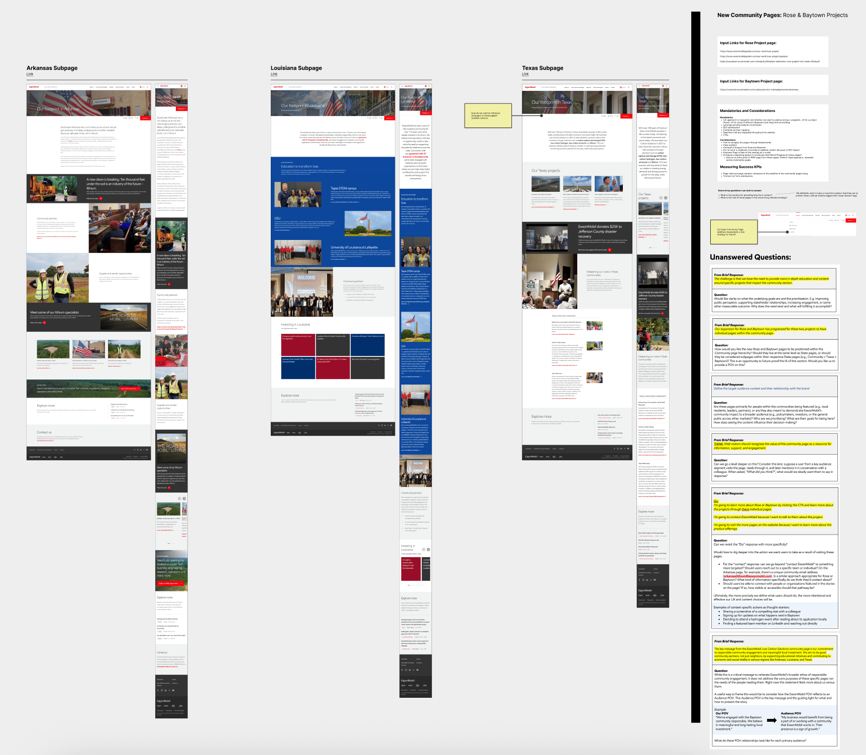
Day to day operations consisted of delivering wireframes, layouts, and UX strategies aligned to the web playbook principles I defined at the onset of the work.

Outcomes
What success looked like
Conversion, priority journeys
2.4%
3.6%
Engaged sessions per user (indexed)
100
128
Bounce rate, key pages
54%
36%
Design-system adoption across agencies
94%
The redesign became a growth channel — conversion up across every priority journey.
Experience quality rose — engagement up, bounce down, usability benchmarked higher.
A governed design system scaled across four agencies without losing cohesion.
LCS differentiated itself from its parent — a brand with its own voice.
My agency earned the lead role and expanded scope; design maturity rose team-wide.
Help!
You see a lot more portfolios than I do. Help me out by making a selection below:
Be honest...what do you think of this case study?
Needs work
Hard to say
It’s great!
Retrospective
If I could do it all again, I’d dive into the tools we had available for measuring success and tailor a more achievable measurement plan. It was too easy for the team to dismiss data collection when it was clear what we wanted to collect but it wasn’t clear how we would collect it.
But honestly, the biggest lesson was simpler: solving problems is rarely about a revolutionary idea. Sometimes, you just need someone to walk in, point at the chaos, and tell a roomful of people a story that gets them excited about what come next.
Ready to talk?
Let’s get connected.
Contact Brendan
Want to see more?
See another project
Aligning four agencies under One UX Strategy for ExxonMobil’s newest business unit
ExxonMobil launched Low Carbon Solutions (LCS) to commercialize decarbonization inside a legacy oil brand — a 0→1 experience split across four agencies with no shared direction. As UX lead, I owned the experience strategy and the governed design system that let teams ship, and grew the metrics a business cares about: conversion, engagement, adoption, and speed.
+41%
conversion on priority journeys
+28%
user engagement, -34% bounce
94%
design-system adoption, 4 agencies
2x
faster design-to-launch
My contributions
01 - Strategy
Defined a UX strategy where none existed
Framed an undefined 0→1 problem into a point of view and 5 core user journeys.
02 - Systems
Design systems & governance
Rebuilt and governed a scalable system with components, patterns, and accessibility baked in.
03 - Vision
Aligned leadership around one UX vision
Won lead-agency status and expanded scope by telling a story leadership could act on.
04 - Impact
Business Impact
Tied design to outcomes leaders recognize — conversion, engagement, adoption, and delivery speed.
The Situation
ExxonMobil’s Low Carbon Solutions (LCS) division was formed to commercialize decarbonization technologies under the umbrella of a legacy oil brand. The business unit was new, ambitious, and under intense scrutiny internally and externally.
When I joined the project in early 2024, I was originally tasked with optimizing user journeys between the parent site and the LCS business unit site. While learning what I could about the brand, the users, and the agencies working on it, it became clear that the absence of a unifying strategy was leading to duplication, misaligned priorities, and frustrated clients forced to mediate cross-agency communication.
It became clear that the technical challenges weren't the primary obstacle. The bigger problem was organizational: four agencies moving in different directions without a shared vision.

Role
UX Lead

Stakeholders
ExxonMobil LCS C-suite
Marketing, Brand, and Product
Agency Collaborators
4 external agencies separately owning content, development, UX, & strategy

Timeline
2024 Q1 - 2025 Q4
Process
Differentiating corporate and low carbon customers
First, I audited the experience and put the truth on the table
I did a focused UX audit of user journeys between the parent site and the LCS site, documented the inconsistencies, and showed precisely how the overlapping language and missing links were undermining the ability of the LCS brand to target its niche users and differentiate its value.
I built a crystal-clear deck to put the reality of the current situation on the table:
- What was happening
- Why it was happening
- How it confused users
- and How we could immediately improve
That deck got attention fast and earned me a seat at the larger cross-agency table.
Why this approach
I wasn’t going to convince anyone by solely pointing at the problem. Problem statements don’t matter to anyone if they aren’t paired with solutions.
Then I worked with strategists and writers to define a real point-of-view
A person’s ability to clearly understand who you are and what you offer is directly a result of both:
- Having a core truth that is exceedingly simple and
- The ability to elaborate upon that truth articulately.
This intersection between content, strategy, and UX requires parity in perspectives to create good output. To work for a solution, I collaborated extensively in newly built relationships across agencies so that we utilize our available combined resources and confidently find an answer to the question: “what is the brand’s point-of-view?”
It’s not an easy question to answer and its one that has a different answer for every person you ask.
While I could have immediately started plotting research methods and interview questions, I started by reviewing insights-rich materials from customer research data, focus group results, engagement analytics, and usability testing. All of it varied in recency and fidelity and there was no governance over the collection, which so often becomes the death of great ideas.
The analysis of the prior work informed ensuing audits and working sessions designed to fill in the gaps.
I translated what I heard into 5 core UX journeys that plainly showed users’ needs for the web site and how those intersected with the business’s needs.
I pitched to clients and when I walked them through the work, it *clicked.* Each time we discussed an idea and agreed it isn’t right for the brand, it communicated something to the entire team about what the brand is not.
The outcome of this was a point-of-view that felt clean, smart, and distinct. That became the engine that powered ideas, and everyone rallied around those ideas because they had a stake in them.
We earned client trust from this. They named us the lead agency of the inter-agency team and we took on more responsibility and a larger scope of work.
Why this approach
The vision gave everyone a directive that didn’t threaten their autonomy and began to dispel the uncertainty getting in the way of creative work.
Slides from the deck I created that highlighted opportunities for improvement in the current state. This helped the team come together and agree on direction for the site, which I articulated into 5 core UX journeys.
Auditing the experience and identifying 9 UX strategy guidelines to govern the digital experience.
I built systems that made design and content work more efficiently
With the point-of-view defined, the next bottleneck was structure. The site was full of patterns that contradicted each other.
I did an exhaustive UX audit to identify inconsistencies and UX improvements. I iterated on what I had produced to categorize my 154 recommendations between 9 UX Strategy Guidelines.
These guidelines included governance recommendations for:
- Headline copy length
- Text CTAs: Primary, secondary, and inline
- Motion and interactivity
- and more
Then I collaborated with the visual designers and dev team to refine and validate everything.
Everything lived in Figma, which made it an easy reference for everyone across the network of agencies.
The tricky part was that the agency responsible for implementation owned the official design system, which didn’t live in a working design file.
To create a page, our inter-agency team relied on excessive communication and an incomplete documentation website. Nuance was lost and there were so many fringe cases we could have started our own rodeo.
So I rolled up my sleeves and tediously reverse-engineered the entire design system frame-by-frame. It wasn’t pixel perfect and it took time to replicate updates but it was evident that we needed this to do our work well.
This became the system my team actually used. Designers were able to produce more creative work that refined and separated the visual identity of the LCS brand because seeing the boundaries clearly showed them how much more they could push.
Writers appreciated it too because they could actually visualize the result of their writing in layout before it was handed off to be implemented, encouraging refinement.
The entire workflow sped up noticeably and that unified vision remained a beating drum that kept us all moving towards the same targets.
Why this approach
Systems thinking was the lever for both creativity and speed. Once structure existed, the team’s creativity soared.
I operationalized the vision and led day-to-day execution
Once the systems and direction were in place, the work shifted into a steady rhythm. We were consistently asked to create new pages or refine existing ones, and I led the UX for a complete redesign of the business unit’s web site.
This phase was all about making the system real. I partnered with writers to shape content, worked with designers using the Figma system I built, and checked every page against the priorities we had defined for LCS.
My focus was keeping the work consistent and intentional. Each page reinforced the LCS identity instead of drifting away from it. And because the structure was solid, the team moved quickly and leadership trusted the output.
Day to day operations consisted of delivering wireframes, layouts, and UX strategies aligned to the web playbook principles I defined at the onset of the work.
Outcomes
What success looked like
Conversion, priority journeys
2.4%

3.6%
Engaged sessions per user (indexed)
100
128
Bounce rate, key pages
54%
36%
Design-system adoption across agencies

94%
The redesign became a growth channel — conversion up across every priority journey.
Experience quality rose — engagement up, bounce down, usability benchmarked higher.
A governed design system scaled across four agencies without losing cohesion.
LCS differentiated itself from its parent — a brand with its own voice.
My agency earned the lead role and expanded scope; design maturity rose team-wide.
Help!
You see a lot more portfolios than I do. Help me out by making a selection below:
Be honest...what do you think of this case study?
Needs work
Hard to say
It’s great!
Retrospective
If I could do it all again, I’d dive into the tools we had available for measuring success and tailor a more achievable measurement plan. It was too easy for the team to dismiss data collection when it was clear what we wanted to collect but it wasn’t clear how we would collect it.
But honestly, the biggest lesson was simpler: solving problems is rarely about a revolutionary idea. Sometimes, you just need someone to walk in, point at the chaos, and tell a roomful of people a story that gets them excited about what come next.
Ready to talk?
Let’s get connected.
Contact Brendan
Want to see more?
See another project